

When four photos are worth taking
Use this small brief when you can describe the general look you want but keep changing your mind after seeing it in another mirror or another room. It is especially helpful for a blend that appears softer outside than indoors, for a transition from darker roots to lighter lengths, or for visible silver that is concentrated in one area.
Solve a visible decision, not every decision
The aim is simple: preserve the clues behind a colour preference before memory turns them into a vague request for “brown” or “grey.” A front image can establish the overall impression. A side image can reveal where light catches the lengths. A close view of the parting can show whether the root area looks deeper, cooler, warmer or more mixed than the rest.
This record is not a formula for ordering by photograph. It cannot settle comfort, cap construction, density, exact fit, or how a fibre will look under every light. Keeping the colour question separate makes the discussion clearer: first identify what is visible in the images, then ask what must be checked against actual samples or a specific item.
- Take the set when your reference look changes noticeably between home, office or outdoor light.
- Use it when grey is uneven, when a root-to-length change matters, or when a past colour description caused confusion.
- Skip repeated retakes once four clean views show the same useful contrast; add a note instead.
Set up light, mirror, photos and notes
Choose a time and place with one dominant light source. Stand facing that source rather than placing it behind your head, keep the background plain, and use the same phone or camera for all four pictures. If daylight is used, describe it as bright, overcast or shaded; the label matters more than chasing a perfect-looking image.
Keep the phone settings quiet
Turn off beauty filters, portrait effects and colour-enhancing modes if your device offers them. Avoid flash and avoid a window plus a warm ceiling lamp in the same frame. Adobe explains that white balance affects all photo colours: overcast daylight may look blue, incandescent lighting can look yellow or orange, and some fluorescent lighting can appear green. Adobe’s white-balance explanation is a useful reason to record the light instead of assuming the image is neutral.
A small neutral reference can help you notice an obvious cast, but do not treat white paper, a wall or a garment as calibrated. X-Rite notes that many ordinary white or grey objects are not neutral under all lighting conditions. Keep any reference in the frame only as a practical cue, and retain the original file so an adviser can see what the phone actually captured.
- Use one location and one device for the complete set.
- Keep hair dry and arranged as it is normally worn before taking the pictures.
- Name the light in plain words, such as “window shade at midday” or “office ceiling light.”
- Send originals or unfiltered copies rather than screenshots that have been edited again.
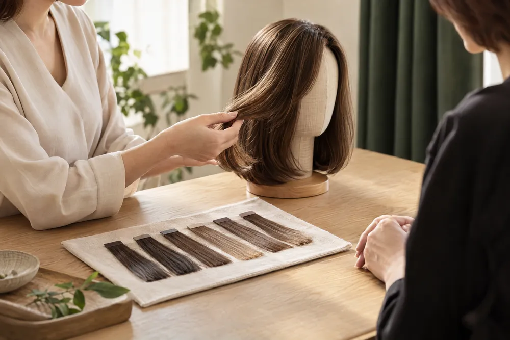
Build the four-view colour record
Each photograph should answer a different practical question. Frame enough hair to show the overall impression, but move closer only for the parting or a localised streak. Take the four pictures in the order below and give each a short filename or message label. That sequence helps another person compare like with like rather than hunting through a camera roll.
Give every image one job
Keep your face and hair angle steady for the two front views. For the side view, choose the side where a grey concentration, a lighter panel or a warmer length is most visible. For the parting or crown view, ask a helper if needed, but do not pull the hair so tightly that the natural distribution disappears. The aim is a truthful observation record, not a flattering social post.
Add one sentence after each view
Write what changes, rather than guessing a technical colour name. “The silver is most visible around the temples outdoors” is more useful than “ash grey.” “The lengths look warmer than the root under the lamp” gives a clear point for comparison. Also note whether the image shows your own hair, a saved reference look, or a wig you already own, so the origin of the visual is never assumed.
- Do not crop away the root area if the root-to-length relationship is part of the request.
- If a reference hairstyle is included, label it as inspiration rather than your present colour.
- Keep the four files together and send the notes in the same order.
Read the visible clues before naming a shade
Look across the four images before writing an enquiry. The most useful clues are usually relationships: what looks darker beside the face, where lighter strands begin, whether shine hides depth, and whether grey reads as a solid panel or scattered strands. Those relationships are easier to discuss than a colour name that changes from one screen to another.
Describe placement, contrast and warmth separately
Start with placement: temple, fringe, parting, crown, side, nape or lengths. Then state contrast: does the lightest area look subtly blended, clearly streaked or sharply separated from the base? Finally state the visual direction: does the colour seem warmer, cooler or neutral in each light? This three-part note gives a clear basis for an adviser to say which feature can be considered and which needs a swatch check.
Do not use a shiny highlight as proof that the underlying colour is lighter. A bright strip can be a reflection, especially on smooth hair. Compare the same area in the second-light photo. If the apparent change moves with the light, write that down; it may be a lighting effect rather than a stable placement pattern.
Make grey distribution a specific question
If silver matters, distinguish percentage from location. A small amount concentrated around the face can read more strongly than the same amount dispersed through the lengths. Mark the view where it is most visible, then ask whether the desired distribution is feasible for the selected approach. The custom wig grey percentage page is a relevant starting point for framing that enquiry; photographs alone cannot confirm a final proportion.
| Photo | What to show | Note to send |
|---|---|---|
| 1. Front in your main daily light | Overall depth around face, fringe and lengths | Name the light and say what colour impression feels most familiar. |
| 2. Front in a second light | How warmth, coolness or shine changes | State what changed from photo 1 without guessing why. |
| 3. Preferred side | Temple blend, streak placement and length contrast | Identify the side and the area you want compared. |
| 4. Parting or crown | Root depth and visible distribution near the scalp area | Say whether this view shows current hair, a reference, or an existing wig. |
Turn the notes into useful selection questions
A good enquiry repeats the evidence and asks one answerable question at a time. Instead of asking only “Can you match this?”, state the four-view observation, name the feature you care about, and ask what comparison would be needed. This approach leaves space for the adviser to clarify the product type, physical sample, construction and care considerations that images cannot establish.
Ask about the feature you can see
For example, write: “In photo 1 the base looks medium brown. In photo 2 the lengths appear warmer. I would like the face area to stay softer than the parting. Which physical colour samples should I compare?” If a custom grey hair human hair wig is under consideration, add whether the priority is scattered silver, a face-framing concentration or a more even blend. That is clearer than requesting a named shade alone.
Compare ready-made ranges without making assumptions
A reference brief can also help you narrow ready-made options. Use Gabor wigs to browse a range after you have written down whether you are looking for depth, a root effect or visible blending; do not assume a catalogue image reproduces the same tone on every screen.
If a highlighted or dimensional look is the question, reviewing BelleTress wigs can help you prepare a more precise colour enquiry. Compare the named colour information and available imagery with your notes, then ask for confirmation rather than treating the online image as a physical sample.
For a softer face-framing effect, Envy wigs offer another catalogue route to consider. Keep the request focused on what your four photos show, such as the contrast at the temples, instead of transferring assumptions about fibre, cap or stock from a photograph.
Where your brief points to a cooler or more even overall impression, Rene of Paris wigs provide a separate range to review. Save the style and colour names that seem relevant, then use the second-light image to explain which appearance you are trying to preserve.
When a root-to-length relationship is the main clue, browse Estetica wigs as one possible comparison. The productive question is whether the visible root effect and length contrast are close enough to inspect further, not whether a thumbnail guarantees a match.
If the record shows a simple all-over tone with a small area of visible variation, Noriko wigs can be reviewed as a distinct brand catalogue. Include the four labels with your message so the discussion can separate an overall shade preference from a localised streak or silver placement.
- Say which photo is your most representative daily-light view.
- Name the one feature you want retained: depth, warmth, root contrast, silver distribution or face framing.
- Ask which samples, product details or further views are needed before choosing.
- Treat every range as a comparison route, not as confirmation of present availability.
Recognise false signals and photo limits
A four-photo brief is deliberately better than one photo, but it remains a visual starting point. Lighting, automatic processing, screen settings and styling can alter what appears in a file. Say what you do not know rather than silently filling the gap with a colour name. This makes a later sample comparison more efficient and avoids building a decision on a misleading cue.
Mixed light and automatic correction can mislead
X-Rite explains that changing light can change how a camera reproduces colour and that neutral targets are used to reduce shifts and improve repeatability. Its ColorChecker target guidance also notes the challenge of blended lighting. In practical terms, a window on one side and a ceiling lamp on the other can make one side of hair look cooler while the other appears warmer. Retake that view under one dominant light rather than deciding which side is “correct.”
A phone may also brighten shadows, deepen contrast or adjust colour without showing you the adjustment. Keep the device, distance and basic framing consistent, and do not compare an edited reference image with an unedited current-hair image as though they were equivalent. The useful conclusion may simply be: “This image needs a sample check.”
Keep appearance enquiries separate from health claims
Someone looking for a wig for chemotherapy hair loss may still use the same four-photo method to describe a preferred visible tone, but the photographs do not determine clinical suitability or give treatment advice. The cancer wigs page is an appearance-focused enquiry route. Share comfort, scalp-sensitivity or treatment-related concerns with the appropriate healthcare professional and ask a wig adviser only about the product information they can confirm.
- Do not judge the final tone from a compressed chat preview alone.
- Do not infer cap construction, heat tolerance, comfort or fit from a colour photograph.
- Do not use a celebrity or heavily filtered reference as evidence of your own hair colour.
- If the lighting is mixed or unknown, label the uncertainty and ask for a physical comparison.
Send a compact brief for the next enquiry
Before sending, place the four photos in order and add a short message that can be read without guessing. Keep it factual. The message should identify what the pictures are, where the colour changes, which view feels most representative and what you want to compare next. This takes less time than repeated descriptions and gives a useful starting point for a custom or ready-made discussion.
Use this four-line message structure
Line one: “Photo 1 is my usual indoor daylight view; it shows the overall depth I recognise.” Line two: “Photo 2 is outdoor shade; the lengths appear cooler and the silver around the temples is clearer.” Line three: “Photo 3 shows the side where the lightest area is most visible.” Line four: “Photo 4 shows the parting; I would like to compare physical samples for a similar relationship.” Add whether you are considering custom work or a named ready-made option.
Choose the next action, not a final answer
If your main question is a visible grey blend, begin an enquiry through the grey-percentage route and attach the record. If you have narrowed a ready-made range, include the exact style and colour name you want to inspect. OWNSTRAND can then clarify what can be compared for the chosen approach. You can also send the four labels and your single priority question through WhatsApp rather than relying on an unlabelled camera roll.
- Attach all four original or unfiltered images in order.
- State the lighting for photo 1 and photo 2.
- Name one priority and one uncertainty, such as temple silver placement and root depth.
- Ask for the next check: samples, a closer product view, or information about the selected approach.
| Record element | Useful for | Still needs confirmation |
|---|---|---|
| Front view in main light | Overall depth, face framing and the colour impression you recognise | Physical shade comparison and how the tone appears in other settings |
| Front view in second light | Whether warmth, coolness or reflection changes your impression | Which change comes from light, camera processing or the hair itself |
| Side view | Placement of a streak, temple silver or length contrast | Exact density, fibre behaviour and construction |
| Parting or crown view | Root depth and localised distribution close to the scalp area | Fit, scalp comfort, cap details and final grey proportion |
| Short written notes | Your priority and the next question to answer | Availability, exact price and any feature not shown in the record |
Ask OWNSTRAND on WhatsApp
Tell us the style you have in mind. We can discuss the options, quotation and arrangements before you decide.
Ask OWNSTRAND on WhatsAppBefore you choose
Can four photos give an exact custom wig colour match?
No. Four photos can make a preference and its lighting changes easier to explain, but screens, cameras and surrounding light can change colour. Use the record to decide what physical samples or product information to compare next.
Which four photos should I send for a grey blend?
Send a front view in your main light, a front view in a clearly different light, the side where grey is most visible, and a parting or crown view. Label whether silver is scattered, face-framing or concentrated in one area.
Should I edit the photos before a wig colour enquiry?
Avoid beauty filters, colour edits and screenshot reprocessing. A plain original image with a short lighting note is more informative than a polished image whose colour treatment is unknown.
Further reading
- Adobe: Adjusting white balance settings to improve photosSupports the explanation that white balance affects digital-photo colour, different lighting produces different casts, and consistent lighting improves comparison.
- X-Rite: ColorChecker White BalanceSupports the caution that lighting changes camera colour reproduction and ordinary white or grey objects are not necessarily neutral references.
- X-Rite: ColorChecker Targets FamilySupports the limited point that colour targets are used for repeatable colour results, multiple cameras and blended-light conditions.